Designing Interactive Documentaries: How to Balance User Agency with Narrative Flow
The Interaction Paradox in Digital Documentary
Interactive documentaries promise something conventional film cannot fully provide: the ability for viewers to choose where to look, whose testimony to follow, and how deeply to investigate a subject. That promise also creates a difficult editorial problem. Every additional choice can strengthen a viewer”s sense of participation, but it can also interrupt the emotional momentum that gives factual storytelling its force. A viewer who is constantly deciding what to open next may become an interface operator rather than an attentive witness.
Meaningful agency therefore depends less on the quantity of available options than on the quality of the decisions being offered. Strong projects make choices feel consequential, legible, and connected to the documentary”s central question. When architecting complex digital experiences, mastering narrative interface design helps storytellers balance editorial authority with user exploration. The interface should invite discovery without forcing the audience to manage the entire structure of the work.
Excessive choice produces cognitive friction when the viewer lacks a clear reason to choose one path over another. A screen filled with unlabeled videos, animated icons, timelines, maps, and expandable panels may appear rich, yet offer little emotional direction. The more productive shift is to treat interactivity as architecture rather than decoration. Nodes, transitions, pauses, and visual cues should all serve the documentary”s editorial purpose. The goal is not unlimited freedom. It is a carefully designed space in which exploration deepens meaning.
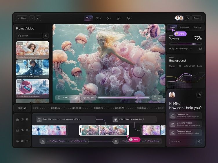
Architecting Narrative Nodes with Hub and Spoke vs Constrained Branching
A hub-and-spoke model gives the documentary a stable center. The hub might be a thematic landing space, a map, a building cross-section, or a recurring visual environment. From that central interface, viewers move into distinct story modules, such as a personal testimony, an archival sequence, an expert interview, or a historical explainer. After each exploration, the viewer returns to the hub with a stronger understanding of how that module relates to the larger subject.
This structure is especially effective when the documentary contains multiple perspectives that should remain distinct rather than collapse into a single linear argument. A Short History of the Highrise, created by The New York Times and the National Film Board of Canada, demonstrates how archival material and interactive exploration can support several routes through a shared thematic world. Its users could inspect photographs, explore visual details, and move through the history of vertical living in more than one direction. The project”s achievement was not simply the presence of many media items. It was the creation of a coherent environment in which those items retained a relationship to a central subject.
Constrained branching offers a different balance. Instead of returning viewers to one central hub after every module, it allows a sequence of meaningful choices while controlling the number of possible outcomes. A testimony may lead to two related archival paths, but both eventually return to a shared editorial beat. An investigation may open several evidence threads, yet each thread supplies information needed for the next chapter. This approach prevents dead ends and reduces production complexity while preserving the feeling that the viewer”s route matters. The architecture should be mapped as a network of purposeful nodes, not as a collection of isolated assets.
| Design model | User retention | Editorial control | Production overhead |
|---|---|---|---|
| Hub and spoke | Strong when the hub is visually clear and rewarding | High, because every route returns to a controlled thematic center | Moderate, with substantial investment in the central interface |
| Constrained branching | Strong when choices feel personal and consequences remain visible | Moderate to high, depending on how tightly branches reconverge | Higher, because multiple transitions and states require testing |
| Open branching | Unpredictable, with a higher risk of abandonment | Lower, particularly when users miss essential context | Very high, due to extensive content, state management, and quality assurance |
The practical decision is not whether one model is universally superior. It is whether the story benefits more from orientation or consequence. A hub is useful when the subject has several thematic dimensions that need a visible frame. Constrained branching works well when the documentary is driven by investigation, chronology, or escalating emotional stakes. Both models can also coexist. A chapter may begin with a controlled sequence, open into a small branching inquiry, and then return to a visual hub that resets attention before the next movement.
Invisible Signposts and Ambient Micro-Affordances
Good wayfinding does not always look like wayfinding. A dynamic audio cross-fade can signal that the viewer has entered a new narrative register before a title appears. A change in room tone may move the audience from a survivor”s personal account to an institutional archive. A subtle shift in color temperature, typography, or image scale can distinguish memory from evidence without adding another explanatory panel. These signals are valuable because they preserve immersion while still communicating structure.
Persistent orientation can also be spatial. A small ambient map, a discreet chapter constellation, or a low-contrast progress marker can remain present as the viewer explores. The device should answer three questions without demanding attention: where the viewer is, what has been explored, and what remains possible. Research into modern interface mechanics highlights four useful heuristics: affordance, consistency, feedback, and minimalism. In an interactive documentary, those principles translate into cues that make actions obvious, maintain a stable mental model, communicate consequences quickly, and show only what the current moment requires.
- Audio transitions can announce a structural shift without covering the screen with labels.
- Ambient maps can preserve spatial and thematic orientation while remaining visually quiet.
- Contextual breadcrumbs can reveal the relationship between a current scene and the wider documentary.
- State feedback can show that an interview, archive, or evidence thread has been viewed without interrupting playback.
Breadcrumbs should reward curiosity, not expose the entire plot. For example, a viewer might see that a testimony belongs to a broader chapter about displacement, but not receive a list of every future revelation. This preserves editorial hierarchy. The most important material should remain visually and narratively prominent, while secondary material becomes discoverable through context. When every item receives equal visual weight, the interface quietly tells the viewer that nothing matters more than anything else.
Designing for Intentional Friction and Pacing
Immediate clickability is not always a virtue. In solemn journalism, the rapid succession of tappable elements can trivialize testimony and encourage superficial consumption. A viewer who can skip instantly from a personal account to an infographic may never absorb the emotional or ethical weight of the first scene. Intentional friction creates a pause between receiving information and acting on it. That pause is not a technical failure. It can be part of the documentary”s argument.
Useful forms of friction include a short pause before a sensitive testimony begins, a timed transition that allows an image to settle, or a gating mechanism that asks the viewer to acknowledge context before opening graphic material. Gating should be purposeful rather than punitive. If every chapter is locked behind unnecessary prompts, the experience becomes bureaucratic. If a pause appears only where reflection or informed consent matters, it establishes a respectful rhythm. Sensory focus can serve the same function. Reducing motion, dimming nonessential interface elements, and isolating a single voice can direct attention more effectively than adding another instruction.
Fragmented source materials can gain coherence through radical juxtaposition. The technique associated with experimental filmmaker and choreographer Yvonne Rainer uses interruption, repetition, unexpected images, titles, music, and shifts in voice to unsettle habitual expectations. In an interactive documentary, juxtaposition might place an official statistic beside a private recording, or move from a still photograph to a present-day testimony without explaining every connection in advance. The resulting gap asks the viewer to interpret. The work remains factually grounded, but meaning emerges through the deliberate arrangement of materials.
Studies of interactive documentaries addressing gender violence, including Mujeres en Venta and The Quipu Project, show how non-linear pathways can combine autonomy with emotional and civic engagement. The projects use testimony, interviews, archival material, and participatory structures to let audiences navigate difficult realities. Their lesson is not that every documentary should provide dozens of routes. It is that interaction becomes meaningful when the route itself helps the audience understand the conditions, voices, and consequences being represented.
A Four-Step Framework for Balancing Agency and Authorship
Agency and authorship become easier to balance when they are designed in sequence. Do not begin with a feature list or a visual metaphor. Begin with the story”s emotional logic, then decide where interaction genuinely improves comprehension, perspective, or participation. Every interactive element should have a job that a passive video or article could not perform as effectively.
- Map the emotional spine before defining interactive touchpoints. Identify the sequence of emotional and intellectual turns, including the moments that require acceleration, silence, confrontation, or release. Mark which beats are non-negotiable and which can support exploration. This prevents optional media from displacing the documentary”s central movement.
- Assign distinct interaction budgets to each chapter. Not every chapter needs maps, branching choices, annotation tools, and archival galleries. Give each section a limited interaction budget based on its editorial role. A chapter focused on evidence may support comparison and sorting, while a chapter centered on testimony may need almost no visible interaction beyond pacing and access.
- Prototype navigational friction to audit drop-off and engagement. Test pauses, gates, transitions, and branch points with real users. A high drop-off rate may indicate confusion, but a longer dwell time can indicate attention rather than failure. Observe whether users understand why a choice matters and whether they can recover from an exploratory detour.
- Strip away non-essential UI elements to let primary media breathe. Remove controls, labels, animations, and decorative overlays that do not improve orientation or interpretation. The principles of consistency, feedback, and minimalism are particularly useful here. If an element does not clarify an action, communicate a consequence, or deepen the story, it should earn its place again through testing.
State management deserves special attention during this process. Interactive-fiction design demonstrates that complex world states can be handled through visible links, object-based actions, inventories, and suggestion-driven interfaces rather than opaque command systems. The same principle applies to documentary navigation. Viewers should not need to remember which archive they opened, infer whether a chapter is complete, or guess what a symbol means. The interface can carry that cognitive burden quietly, allowing the audience to spend attention on the people and questions at the center of the work.
Prototype the structure with paper cards, a simple flow diagram, or low-fidelity clickable screens before commissioning polished animation. This exposes weak nodes early. If a chapter cannot be explained in a few clear sentences, its interface is unlikely to rescue it. Strong production begins with a readable architecture, then adds visual richness only where it reinforces the subject.
Build Experiences Where Agency Deepens Meaning
Interactive documentary design succeeds when the interface gives viewers room to investigate without abandoning them inside a maze. Hub-and-spoke structures provide orientation, constrained branches create meaningful consequence, and ambient signposts protect the continuity of attention. Intentional friction adds ethical and emotional weight, particularly when the subject demands patience rather than speed.
The most empowering experience is rarely the one with the most options. It is the one in which every choice feels understandable, relevant, and connected to the documentary”s larger purpose. Before the next interactive project enters production, audit its narrative velocity: identify where users need freedom, where they need guidance, and where the interface should disappear. Then remove one choice, one overlay, and one transition that does not deepen understanding. Clarity before decoration is not a limitation on agency. It is the condition that allows agency to matter.